

Sandbar Restaurant Branding
Logo Design, Custom Lettering, Art Direction, Sign Design
OVERview:
Most Approachable Hangout on the River
Your biggest asset — dining/drinking outside on the river — is attractive to many different personas. The key for this concept will be creating an experience/brand that is memorable and unique, yet welcoming and accessible. Tulsans feel comfortable and want to spend time here because the vibe is relaxed and vibrant.
PERSONA:
The Family with Kids
Key Insight: There is an established pattern of families spending time on Riverside. Gathering Place averages 10-15k visitors per weekend
Timeline:
2 weeks
Sandbar needed to open quickly in order to begin bringing in revenue after the restaurant was closed due to COVID, so our team set up a sprint style process to go from discovery to full brand in 2 weeks.

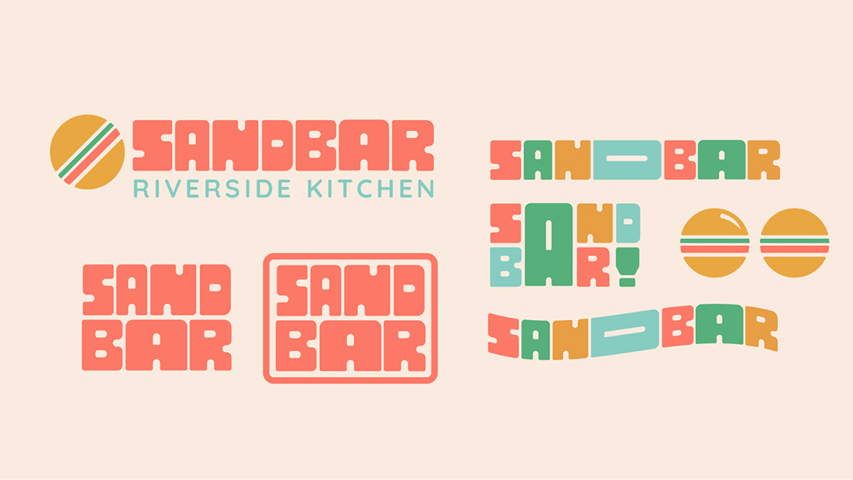
Sandbar Typeface
The lettering used for the primary type in the Sandbar logo is a hand lettered monospaced typeface. The typeface was inspired by retro posters and branding. The typeface uses rounded corners to make it feel more friendly and inviting, with some personality. To maintain legibility, we recommend this typeface be used only for large use cases, such as vinyl on windows or for the logo itself.


Process Overview
Sketches
In the sketch phase, I explored a few character directions as well as some custom type directions. This was very inspired by retro character branding and 50's style type design. Keeping in mind that our persona was families with children, I wanted this to feel very friendly and welcoming, but also memorable compared to the restaurants in the area.

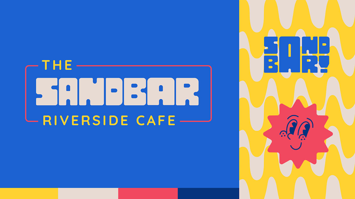
Initial Concepting
Explored both directions of a custom character and/or a custom logotype. Kept the colors bright, yet retro-inspired to bring an approachable aesthetic to the branding.


Chosen Direction
Ultimately, after internal feedback sessions and client feedback sessions, the custom type logo was chosen for its uniqueness and bold color palette. Different from the color palettes in the first round, this color palette leans a little more modern which brings a fun and vibrant feeling to the branding. We switched out the sun for the burger since that would be their main item on their new menu, and it needed to be clear to the customer what type of restaurant this would be.
Thanks for viewing!


